After the functional redesign, an aesthetic redesign of the site is made. In this post we will elaborate on some choices that where made while making the designs. First we will show the final design of the relevant page and then go over the different components that make up the page.
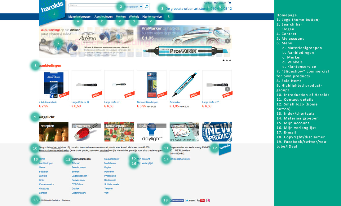
Home Page
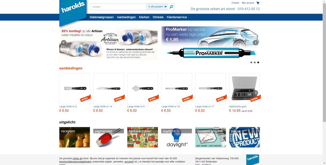
Final Redesign Home Page Harolds
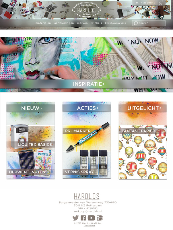
As you can see the site has in general a more centered design. We will walk through the different aspects of the page one by one.

Redesign Home Page - Header
First we see the heading that underwent a lot of changes. For one the logo was changed to include the slogan of Harolds and have a more “art” look. An image was put behind the header to also make the site radiate more the image Harolds wants to convey to their clients.
The search function is put into the main menu-bar of the site. This is because the menu-options and the search-option have the same function, namely navigating the site.
The “My Account” button is made bigger as well as the shopping cart.
The search function is put into the main menu-bar of the site. This is because the menu-options and the search-option have the same function, namely navigating the site.
The “My Account” button is made bigger as well as the shopping cart.

Redesign Home Page - Inspiration function
Harolds is a site that gets mainly visited by creative individuals. These visitors are always looking for information to use in their next project. We think by placing an inspirational artwork on the website for visitors to see, Harolds can contribute more to the experience of the site and create more of a “Harolds-community”.
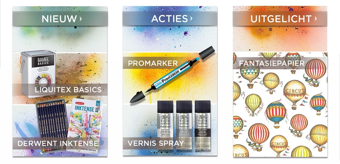
Redesign Home Page - New/Actions/Spotlight
All the information that was currently on the site, lacked a sense of hierarchy. We summarized the current content of the site into three categories. Two already present on the site as main features, and one that was there as a sub-heading.
The products that are shown are somewhat limited to avoid having too much information present on the page. Of course the different headings can all be clicked as indicated by the arrow and more items can be made visible.
The products that are shown are somewhat limited to avoid having too much information present on the page. Of course the different headings can all be clicked as indicated by the arrow and more items can be made visible.

Redesign Home Page - Footer
We decided the classic “overview”-footer had no use for us. We opted for a clean look with all the necessary information present, a toned down new harolds logo and simplified social media icons.
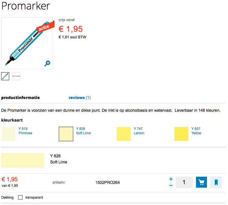
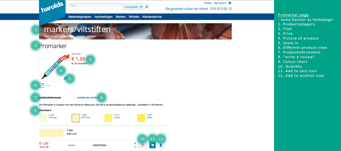
Promarker Page
Redesign Promarker Page
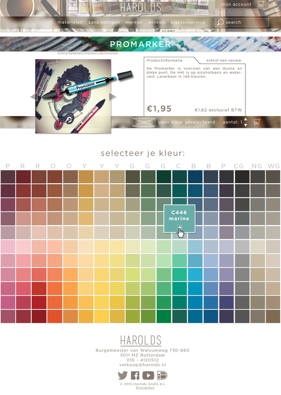
We put the title in a bar with more saturated colours than the other bars, this way we give the title contrast with the rest of the page and thus more attention (see image below).
Redesign Promarker Page - Product Info
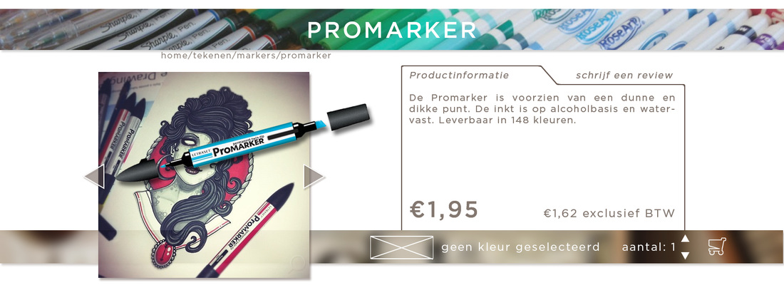
In this image we can also see that we enlarged the product photo and put it into context. This context can inspire the customer and, hopefully, seduce him to buy the product. The context shows the actual value of the product for the buyer. Product Information is put right next to the product in a framed space. The frame emphasizes the existence of the text. It is saying: ‘there is something between these borders’. The ‘write a review’ part is a different tab of this frame, not immediately visible, since we consider this less important than the product information. We emphasized the price by making it bigger and bolder than the rest of the text on the page, since it is an important aspect of the product. We didn’t use screaming red (like the old design) for attention, it is unnecessary and looks cheap (it looks like shopping in a dollar store). To give the customer feedback that a colour has to be selected, we implemented the empty box with the cross and the text “no colour selected”. This indicates that something has to be done first. Unlike the old page, a cart is always visible, not only when you click a colour. People can get confused when the cart is not immediately visible, especially since there are no use cues to indicate that the customer has to click a colour.
Current Promarker Page - Product Info and colour picker
For the colours, we made a more compact overview. The space between the colours has been decreased, this compact view gives the viewer the opportunity to compare the colours easier with each other. We changed, next to this, also the way the colours are categorized. In the old Harolds design, the hues were sort of listed in a vertical manner. Using a gradient-like approach. However, some hue-groups appeared two times in this list; yellow is on the top as well as on the bottom of the list. Which is very confusing. Also the colour-coding was not categorized in any way. The colour list of the redesign has a more natural categorizing system, see image below.
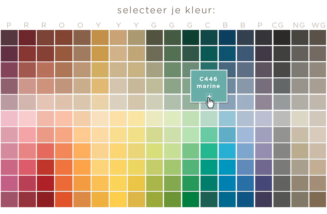
Redesign Promarker Page - Colour Picker
On the horizontal axis the hues are shown. With above them the corresponding letter for the colour-coding (for instance, R for red). The lightness is shown on the vertical axis, with the highest lightness in the middle. Above the middle are the less saturated colours, below the middle are the more saturated colours. This is done to show a more obvious distinction in saturation. When a colour is clicked, a pop up of the colour appears; big enough to show the colour-coding but small enough to still show the colours around it. This last thing is important, because this way the selected colour can still be compared with similar colours.

 RSS Feed
